
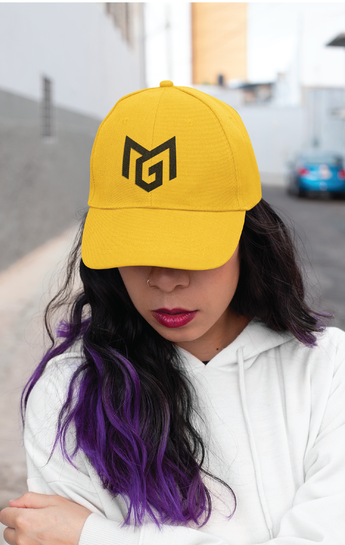
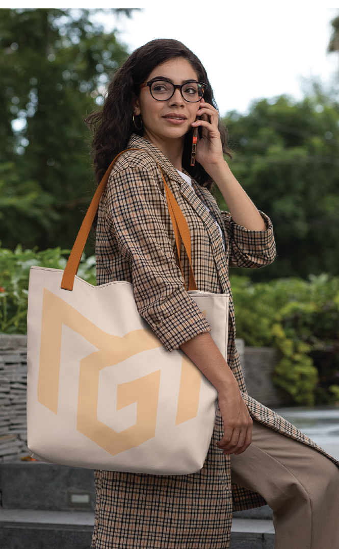
The logo is constructed from the initials of Monday Gift, stylized through a series of sharp, geometric angles that communicate strength, focus, and technical mastery. Rather than using soft curves, the deliberate use of pointed edges and angular lines reflects the precision required in elite football, every pass, tackle, and strike must be calculated and exact. The interlocking structure of the initials creates a compact and balanced form, symbolizing discipline and control, qualities that define a player who reads the game intelligently and executes movements with clarity and purpose.
The sharp angles also visually evoke speed and direction. Much like the rapid changes of movement on the pitch, quick turns, explosive sprints, and accurate ball placement. The logo’s edges appear to push forward, suggesting momentum and agility.
This geometric sharpness mirrors the player’s style of play: decisive, accurate, and fast. As a personal emblem, the mark becomes more than initials; it represents a competitive identity built on precision, speed, and accuracy; core attributes that distinguish a high-performing female soccer athlete.


Stylish
Urbane
Suave
Brand Management
For Inquiries Contact